Museek Prototype

See the finished prototype on Figma
2024
Application designed to help music fans find people to go to concerts. This was done as part of my UX subject at University.
Background and Context
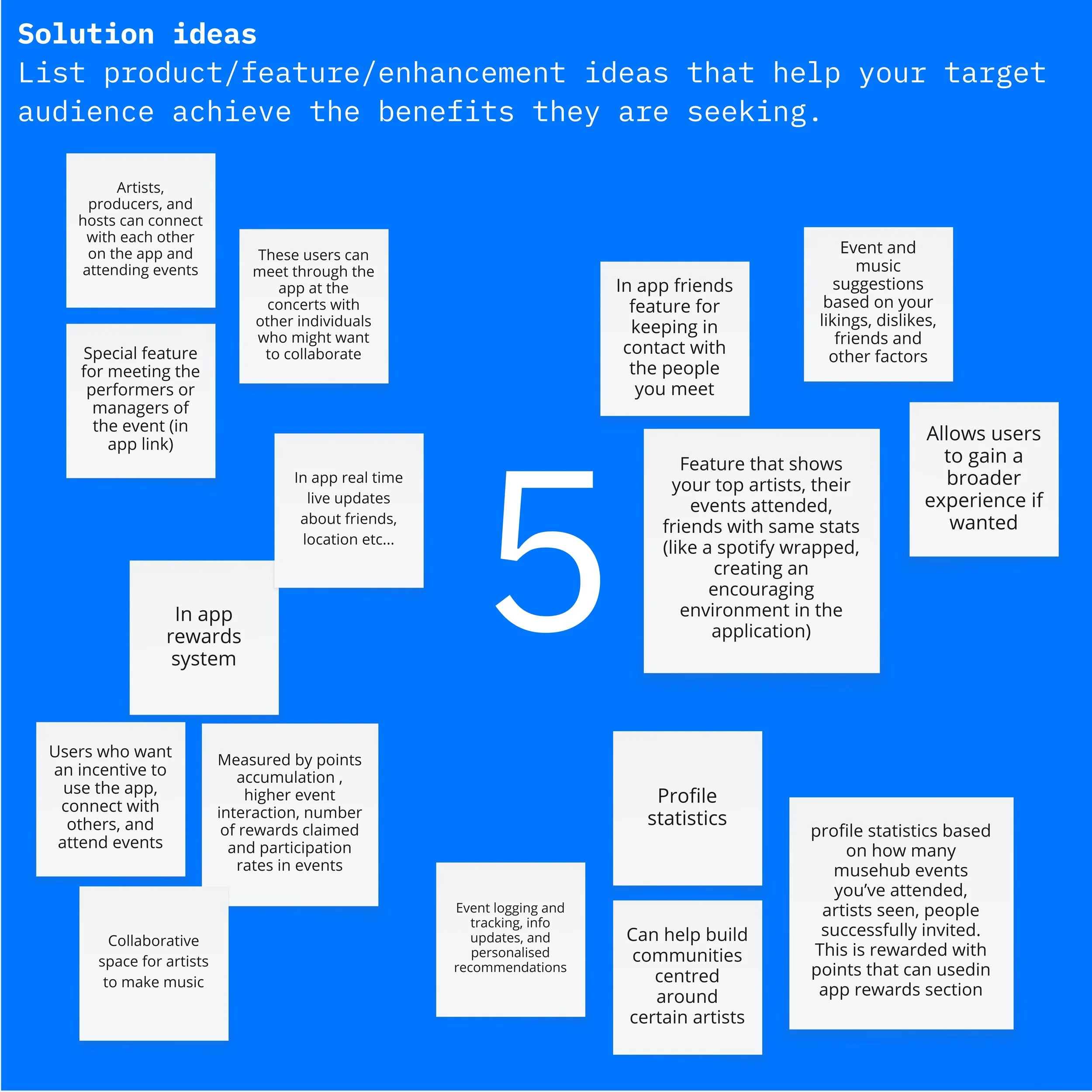
Developed using Lean UX methodology with a target demographic of music listeners under 25.
The design process included user research interviews, lo-fi and mid-fi prototyping, think-aloud usability testing and heuristic evaluation. Insights were compiled into an affinity diagram to prioritise improvements across each iteration.
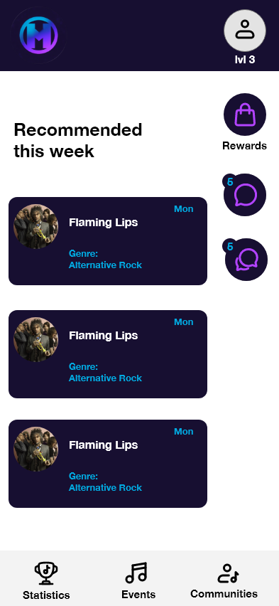
Key features include concert discovery, artist-based lobbies for connecting with other fans, a rewards system for event attendance and Spotify integration.
User Personas


Affinity Diagram

Lo-Fi Prototype

Mid-Fi Prototype


Lean UX Canvas


| Issue # | Usability issue description | Heuristic/s that are violated | Severity | Quote from user | Recommendation(s) for improvement |
|---|---|---|---|---|---|
| 1 | On the dashboard page, there is a navigation menu with all events and stats, but the purpose of all and its connection to the other options is unclear | Visibility of system status, Consistency and standards, Flexibility and efficiency of use | Low | "All doesn't show stats or lobbies" | Rename all to home or dashboard because it doesn't display stats or lobbies, it only shows concerts and communities |
| 2 | Blue tick on profiles in lobby chat doesn't seem to have meaning at face value | Visibility of system status, recognition rather than recall | Medium | "What do the blue ticks mean in chat?" | Create an option that is visible in the chat that triggers the blue tick. Include a label so people know what it does. |
| 3 | There's no way of knowing if people have bought a ticket or are going | Match Between System and the Real World, Visibility of System Status | Low | "How do I know if someone's got a ticket or is confirmed to be going?" | Incorporate a feature that lets a user know who's bought tickets |
| 4 | There's no button for joining a lobby, making it unclear that only one lobby can be joined at a time | Visibility of System Status | Medium | There is no join button, does that mean I can enter any number of lobbies? | Incorporate a join button for lobbies |
| 5 | Music Taste/Genre selection screens don't affect matching with people/or getting shown recommended artists/concerts | User control and freedom, flexibility and efficiency of use | Medium | "Where do I get shown gigs or people based on my music taste?" | Incorporate recommended concerts as an area for seeing concerts and maybe a filter in lobbies that filters by seeing people |
| 6 | It's not clear what the gigs mean in the stats area because it has no title | Match Between System and the Real World, Visibility of System Status | Low | "Are these gigs I have been to? Gigs I can click on?" | Add title e.g. event history, gigs attended |
| 7 | Unsure if I can leave a chat lobby, and if I leave, do I have to navigate back to lobbies to access it? | User control and freedom, Consistency and Standards | Medium | "There's a back button so I can go back home, but if I press it, do I leave the lobby? There's no way of knowing I am still there or can go back to it" | Make a chat bubble on the dashboard that shows you're still in that lobby and a leave button that's more explicit, so you know it's not just to navigate back to previous screens. |
| 8 | Navigation Issues: User profile page appears after lobby page, explore button and popular communities on home screen don't lead to any page. No rewards Screen | Match Between System and the Real World, Consistency and Standards | High | "There seems to be some screens missing and I'm not sure why the username page appears after lobby chat" | Put User profile page above the home page, maybe include a line to link it to show it appears from that page. Also, make sure screens are consistent with the navigation buttons |
| 9 | Green coloured buttons in some places but blue coloured buttons elsewhere | Aesthetic and Minimalist Design, Consistency and Standards | Low | "I think it would look better with one button colour" | Keep blue/green as the only button colour |